eGain University Redesign
The Project
Project Details
eGain University: The learning management platform of the knowledge management and communication company, eGain.
Service provider: Docebo
eGain University was added to the company’s umbrella of resources in 2015 as part of a company acquisition. It had a few dozen courses on it at the time, covering only a small portion of the company’s product. There were also a few recorded webinars. It was also using mostly default settings, with no effort put into its presentation outside of simple branding. This worked for a small learning platform with only a few courses that were dedicated to a small product; however, with its integration into the broader eGain product, which was much more complicated, and with more courses being developed, a restructuring was necessary.
Why This Was Necessary
The learning management system (LMS) use needed to be expanded beyond its original scope to be used to instruct internal and external users beyond simple tasks performed in the company’s product. This would go on to include internal Sales training, onboarding courses, product tutorials, and other extensive certification programs like the Knowledge Academy.
Team Members
Ariel Feist | Project Lead
John Wise | Learning Experience Designer
Timeline
2 months
Previous eGain University Interface
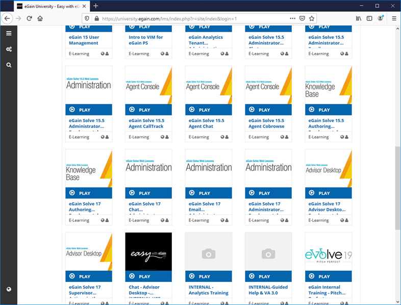
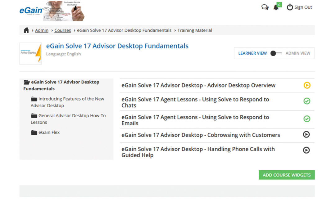
This is what the average user would see upon logging into the application. The page is busy and confusing to new users who are not familiar with the platform.
Courses were bloated with material that could easily overwhelm learners. The excessive content could also overcomplicate the course and make it lose focus.
Challenges
Budget
The service agreement with Docebo created some challenges. The account had been established by the previous owner of the platform, which had an older pricing plan. This meant that we were tied to the limitations of the platform according to the payment plan and not purchase any upgrades, regardless of their significance. Otherwise, we would need to upgrade to a newer and much more expensive account with Docebo, which was not budgetarily possible.
Platform Structure
Docebo’s toolset within the limited account plan had numerous specific restrictions. For instance, you could create pages to house various panels and rows of widgets. However, each page had a limit on how many widgets and rows could be added to it. In addition, for a page to be visible to a user, it had to be added to a menu accessible to the user. This means you could not create as many pages as you wanted; you had to be thrifty in your use of pages and widgets to present the material you wanted.
What Was Delivered
New User Dashboards
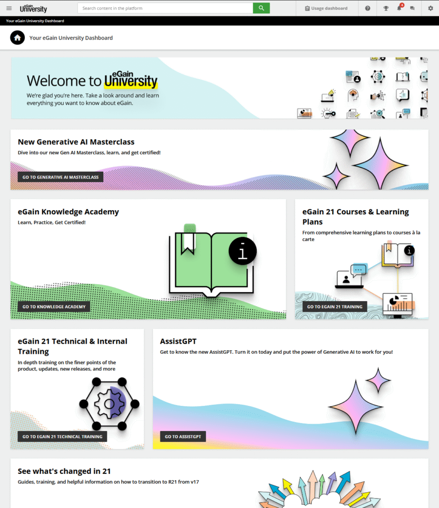
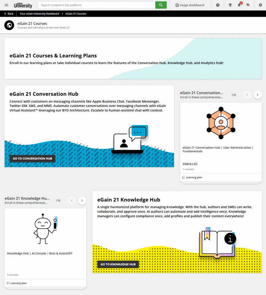
We removed the default display of the LMS that only worked for a small platform in which a user would have access to just a handful of courses to take, and created multiple dashboard home pages. Each of these dashboards had different sets of rows and tiles designed for users of various skill and access levels. John Wise provided the colorful banner and icon designs.
We organized the user accounts to assign the necessary permissions and ensured the correct menus were shown to them. For example, only internal employees saw tiles for onboarding or sales training, while the product training was available for all users on the platform.
Organized Pages With Focused Courses & Learning Paths
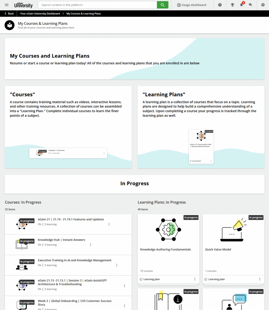
Prior to our redesign, users had to be assigned courses manually by me and other administrators. With our new learning paths and course catalogs established on the platform, it became easy to show users how to enroll in courses and learning paths on their own. We created detailed pages that broke down the hubs of the product and showcased the various courses a user could take.
We also replaced the default page provided by Docebo as the place that tracked a user’s course progress with one that was designed to visually and specifically define what a course or learning plan looked like on the platform.
Lastly, we changed how content within courses was organized. The goal was to keep focused on their subject matters while making sure that any additional resources or collateral were given proper context and instruction.

Additional Resources & ILT
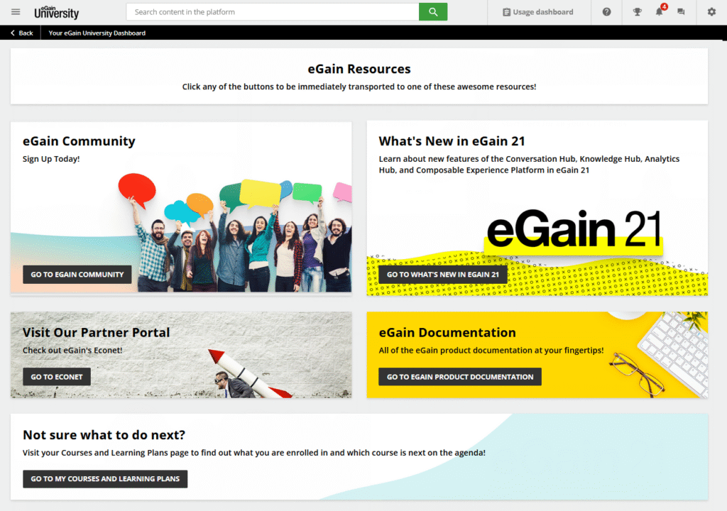
Part of the goal of this redesign was to make the platform the central learning hub for the company. While there were plenty of other domains and portals that a customer or employee could use to get information they needed, we wanted eGain University to feel like a proper home page for the average person. Thus, we added direct links to resources that we felt would be useful to a learner, like the community forums links on dashboards and within courses, for example. We added feedback loops and knowledge checks to our courses to ensure we were able to review how people were doing in the courses and what they thought. We also worked directly with the in-house training team to get them familiar with the platform so that it could be integrated into their instructor-led training (ILT) curriculum.
Lessons Learned
The main lesson I took away from the experience from redesigning the platform was that users could still easily get lost if you didn’t provide the necessary context in the interface. There were some navigational issues tied to the platform that we simply couldn’t change or eliminate, and they would often lead users in confusing directions. So, we would often include the navigational instructions in the courses themselves and any documentation collateral to ensure most learners were able to find what they needed.
Further Improvements
After the initial launch of the redesign, we integrated single sign-on with our internal system so employees would be able to access the learning platform with their company IDs and passwords. We added more material for new employees, interns, and ongoing internal training for specific departments.
We also opened up the platform to allow users to self-register rather than requiring an account be created for them by an administrator. With the lessons we learned regarding permissions and menus, we were able to ensure self-registered users saw only a limited set of learning material and the option to contact the company to request more info or access.
Let’s Connect
I’m here to help and offer my expertise as a technical writer and instructional designer. If you need assistance with your documentation or learning management system, please feel free to reach out.